Effective use of colors in meteorological visualizations
A new paper has appeared in the Early Online Releases at the Bulletin of the American Meteorological Society. This paper is entitled, “Somewhere over the rainbow: How to make effective use of colors in meteorological visualizations” by Reto Stauffer, Georg J. Mayr, Markus Dabernig, and Achim Zeileis.
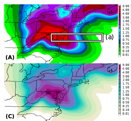
This paper explores whether the rainbow color schemes that many of us use are appropriate or helpful for readers of scientific journal articles. Although not the first paper to make this point*, it is another reminder for authors to spend some time thinking about their figure construction, rather than just using the default settings.
——-
* See also pp. 115-118 in Eloquent Science for more on color schemes and gray shading, as well as Spekat and Kreienkamp (2007).
Spekat and Kreienkamp, 2007: Somewhere over the rainbow—Advantages and pitfalls of colorful visualizations in geosciences. Adv. Sci. Res., 1, 15-21. [PDF]
Declan Valters also sent me this article on the same topic.
“Rainbow Color Map (Still) Considered Harmful” by David Borland and Russell M. Taylor II [PDF].


Those interested in this topic might also want to read this recently published paper in the National Weather Association Journal of Operational Meteorology:
http://dx.doi.org/10.15191/nwajom.2014.0215
Bryant, B., M. Holiner, R. Kroot, K. Sherman-Morris, W. B. Smylie, L. Stryjewski, M. Thomas, and C. I. Williams, 2014: Usage of color scales on radar maps. J. Operational Meteor., 2 (14), 169–179.
Answer: Don’t use GEMPAK.
Did I miss it or did they omit the issue of color blindness?
Jim