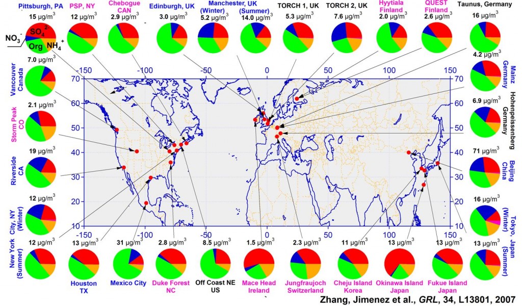
An example of an excellent figure
I had been showing this figure to several students recently about an effective way to plot a lot of spatial data without the figure looking cluttered. I think this is one excellent way to do it. The plots are all ordered around the perimeter of the map, yet the points take you to the locations where the measurements were taken. The order of the plots around the perimeter is arranged by the continental groupings of the data: Europe in the upper right, Asia in the lower right, and North America to the left.
To whoever had the idea for and constructed this figure. I toast you!
Q. Zhang, J.L. Jimenez, M.R. Canagaratna, J.D. Allan, H. Coe, I. Ulbrich, M.R. Alfarra, A. Takami, A.M. Middlebrook, Y.L. Sun, K. Dzepina, E. Dunlea, K. Docherty, P.F. DeCarlo, D. Salcedo, T. Onasch, J.T. Jayne, T. Miyoshi, A. Shimono, S. Hatakeyama, N. Takegawa, Y. Kondo, J. Schneider, F. Drewnick, S. Weimer, K. Demerjian, P. Williams, K. Bower, R. Bahreini, L. Cotrell, R.J. Griffin, J. Rautiainen, J.Y. Sun, Y.M. Zhang, and D.R. Worsnop (2007) Ubiquity and Dominance of Oxygenated Species in Organic Aerosols in Anthropogenically-Influenced Northern Hemisphere Mid-latitudes, Geophysical Research Letters 34, L13801, doi:10.1029/2007GL029979 [PDF].


This flies against the Edward Tufte maxim, “The only worse design than a pie chart is several of them,” the human eye not being very good at distinguishing small differences in angles. Small multiples of bar graphs for each location with accompanying scale (fraction or percentage) would be preferable, but truthfully, representing spatial distributions of proportions is a challenging design problem.
Hi David,
Thanks for your comment. I admit pie charts are not the best way to present data in general, but it’s not small differences in angles that are the main point that the authors want to highlight to this graph. It’s the large differences that are the key. The areas of green wedges in the pies represent the abundance of organic aerosols, and that fraction is large at almost all locations, which demonstrates the ubiquity of secondary organic aerosols in the atmosphere. In that sense, the figure is a success.
I have done bar graphs on a spatial map, and I wish I could feel more satisfied about the outcome. It is not ideal. Figure 2 of Ware et al. (2006).
Ware, E. C., D. M. Schultz, H. E. Brooks, P. J. Roebber, and S. L. Bruening, 2006: Improving snowfall forecasting by accounting for the climatological variability of snow density. Wea. Forecasting, 21, 94-103.
[http://journals.ametsoc.org/doi/abs/10.1175/WAF903.1]
If anyone has a good example of how this worked well for you, please share.