A figure in need of help
April 7, 2010 Filed under Blog, Featured, Posters, Presentations, Writing

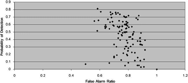
I ran across this figure from an American Meteorological Society journal article recently. It’s just a simple scatterplot, which is so easy to construct, yet this figure has so many problems.
1. False alarm ratio and probability of detection are both quantities that can have values between 0 and 1, but the x axis ranges from 0 to the unrealistic value of 1.2.
2. Making both axes range from 0 to 1 would have made a lot of sense.
3.The graph should be square so that distances along the x and y axes represent equivalent intervals.
4. Why are there horizontal grid lines drawn, but not vertical grid lines? In any case, the horizontal grid lines should be eliminated as they do not contribute anything to the graph.
This figure illustrates just some of the problems with using Microsoft Excel to create publication-quality graphs. Here is a peer-reviewed article (Su 2008) on the subject. If you are going to use Excel, at least go beyond its default values and use commonsense to construct your graphs properly and professionally for scientific publications.
REFERENCE
Yu-Sung Su, It’s easy to produce chartjunk using Microsoft(R)Excel 2007 but hard to make good graphs, Computational Statistics & Data Analysis, Volume 52, Issue 10, 15 June 2008, Pages 4594-4601, ISSN 0167-9473, DOI: 10.1016/j.csda.2008.03.007.


The figure can’t stand on its own. For example, what are the POD and FAR referring too (e.g., tornado events, winter storms, flash floods, etc.)? The gray background should be eliminated too.