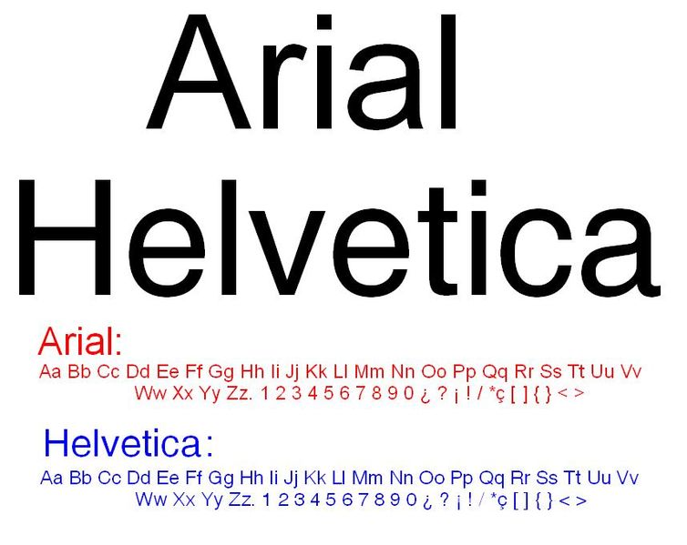
Arial is a cheap imitation of Helvetica
February 16, 2010 Filed under Blog, Posters, Presentations, Writing
While researching the book, I discovered this Web site proclaiming the glories of the sans serif font Helvetica and bemoaning the rise of Microsoft’s rip-off font Arial.
As the Web page says about Arial replacing Helvetica, “To an experienced designer, it was like asking for Jimmy Stewart and getting Rich Little.”
I have to admit that I can now spot the difference between Helvetica and Arial, and for some strange reason, Helvetica just seems to look good from a distance.

(Image from Wikimedia)


I tried but I can’t still spot the differences beteen these two fnts. I don’t see any difference when I look char by char but when a sentence is written there appears to be some difference but I can’t exactly tell what can you? client today asked me to use for a Arial for Titles and Helvetica for body.
Yes, I agree the difference is subtle. Look at the lower-case “a”, for example. Notice the shape of the line at the lower-right corner that completes the “a”.
At least for me, once someone pointed out these aspects of the differences in the fonts, I liked Helvetica even more.
Dave
G caps is clearly diffrnt. Upper case k,r are more beautiful in helvetica font