Why you should use sans serif fonts for figures, posters, and slides.
September 25, 2009 Filed under Blog, Posters, Presentations

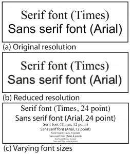
Comparison of serif and sans serif fonts
Serifs are those little vertical lines and flourishes at the ends of letters (like the vertical lines at the ends of the capital S or the horizontal line at the bottom of the lower-case r).
Use sans serif fonts (Helvetica, Arial) because the near-uniform width of the strokes keeps the font readable when reduced in resolution or reduced in font size. Sans serif fonts are more legible from farther away, which is why they are good for posters and slides, particularly the titles and headers.
Serif fronts (Times, Optima) are better for reading large blocks of text where the serifs help to keep your eye focused on a line of text, helping you to recognize the word as a shape, which enhances your ability to identify the word and read quickly.


Comments
3 Responses to “Why you should use sans serif fonts for figures, posters, and slides.”Trackbacks
Check out what others are saying about this post...[…] I had bought Just My Type: A Book About Fonts while waiting in Kings Cross waiting to get home. It’s a book that I’d been wanting to read for a while. I’ve been fascinated with fonts ever since the early Macs got me trying out new fonts. Now, I find myself mostly stuck in my favorites: Helvetica, Times New Roman, News Gothic, and Bookman. I’ve already written elsewhere about my preference for Helvetica over Arial and why you should use sans serif fonts in figures, slides, and posters. […]
[…] on the bottom and top of letters. BUT, if you’re printing large text, Schultz recommends san serif fonts like Arial. I went with Liberation […]
[…] The font of my magazine will be an assortment of sans serif fonts as sans fonts provide a modern appeal and simplistic page structure. A study from eloquent science shows that sans serif fonts are actually easier to read compared to serif fonts. http://eloquentscience.com/2009/09/why-you-should-use-sans-serif-fonts-for-figures-posters-and-sli… […]