Avoiding pie charts

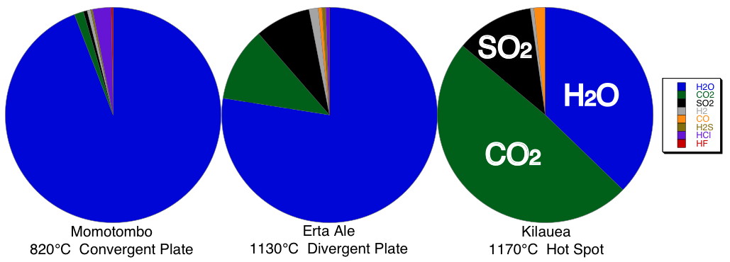
Are these individual pie charts easy to get quantitative information from?
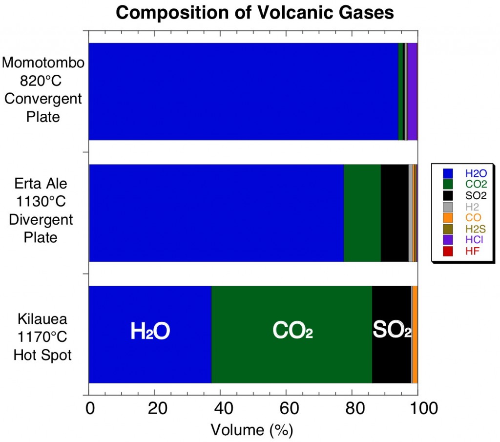
How about when presented like this?

As you can see, obtaining quantitative information from pie charts is near impossible. And, if you want to compare two of them, you can generally tell only the most obvious differences. A more carefully constructed plot using horizontal bar charts makes the data much easier to interpret.


Great tip!
I’ll definitely use this in my independent mapping report.