Be creative in constructing your figures
February 16, 2010 Filed under Blog, Posters, Presentations, Writing
With Adobe Illustrator and other similar graphics packages, scientists are more in control of their figures than ever before. You don’t have to rely on the default values and font types in your graphics software. One thing that you can do is create composite figures where two types of figures are combined to create a stronger story than before.
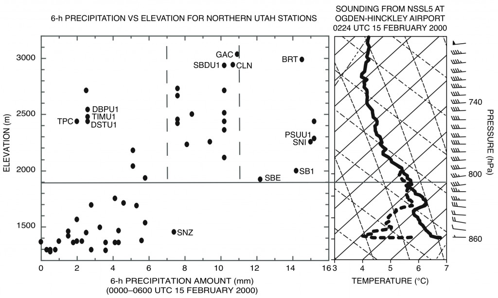
Below is a graph that combines the precipitation amounts as a function of height (left scatterplot) with the sounding drawn to the same height scale (right). This combination figure is a powerful way to show the reduction of snowfall in the mountains below cloud base (approximately the horizontal line at 1900 m in elevation). What creative ways can you think of to present your data by combining two or more figures?
An example of a combination figure. (left) Precipitation amount (mm) vs elevation (m) for stations reporting precipitation during the 6 h ending 0600 UTC 15 Feb. Selected stations discussed in text are labeled. Dataset derived from the work of Cheng (2001). Gray solid and dashed lines represent boundaries between regions discussed in text. Right: skew T –log p plot of observed sounding from 0224 UTC 15 Feb at NSSL5. Temperature (deg C, solid lines), dewpoint temperature (deg C, dashed lines), and winds (one pennant, full barb, and half-barb denote 25, 5, 2.5 m/s, respectively). (Fig. 22 in Schultz and Trapp 2003.)
Schultz, D. M., and R. J. Trapp, 2003: Nonclassical cold-frontal structure caused by dry subcloud air in northern Utah during the Intermountain Precipitation Experiment (IPEX). Mon. Wea. Rev., 131, 2222–2246.


